INSIGHTS
Fueling Global Fintech…and we’re just getting started.
Last week, at Quona’s Annual LP meeting, we announced new branding for Quona. It was a pretty big deal — the new brand is markedly different from the original, and boldly reflects the conviction and confidence we have in our strategy, especially as we emerge from COVID.
At the reception held in New York afterward, one LP said, “I love the new brand — it looks like it’s pulling Quona into the future.” But it’s actually the opposite: Quona has pulled its brand into the future to catch up with the work of the firm, which has been quietly building a formidable portfolio across Asia, Latin America and Africa over the last five years.
In 2015, when Quona Capital was launched, it sprang from global nonprofit Accion. The vision of the firm was to apply the world’s capital markets to the problems causing poverty in our world. Starting by investing off the balance sheet of Accion and then later managing its first third-party Fund, Quona made some early bets in financial inclusion that would later become “name” investments. The initial brand — which remained the brand until last week — was made in soft greens, and looked like two guitar picks overlapping one another to form a Q.
Fast forward to 2020. The world has changed dramatically since the COVID pandemic first took hold, and the decision was made to have the brand catch up with Quona.
When we started discussing a brand refresh back in 2020, we had a set of desires:
- The new brand needed to reflect Quona’s past and future in financial inclusion
- The brand needed to reflect our diverse markets in all their complexity and promise
- The brand needed to convey our core values in shaping the venture industry
While we approached several design firms with the challenge of the brand refresh, we ultimately settled on the magicians at 8 Point Studio in New York. Over the last several months, they’ve worked hard to unearth the perfect new logo, font families, photography style with substance, and custom illustrations.
“Our goal with the Quona brand was to move away from a complicated logo mark and clichéd imagery toward distilled visual strength and authenticity around what makes Quona unique,” says Jen Roos, Founder and Creative Director at 8 Point Studio. “We strove to strategically communicate high performance combined with significant impact that is grounded in Quona’s future-forward fintech focus contributing to emerging markets.”
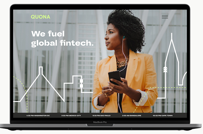
Where we landed was a bold new logo, all capital letters, with a customized “Q” that appears open and in the process of building forward. We also fell in love with a documentary style of photography that enabled us to feature people embracing mobile technology as it ushers them into the future. Custom line illustrations of many of the markets we serve were developed, and a dotted line was laid over them to reflect the world that is still being built, the one where there is room for everyone and no one is left out. In short, a brand that is truly Quona, one that blends purpose with progress, capital with community, and innovation with execution to help founders build a more financially inclusive world.
We’ve never been more excited about fintech’s future, which increasingly moves beyond borders. For all of you who have been with us since the beginning, thank you for your support of us along the way.
Want to learn more about Quona’s take on fintech for financial inclusion and measuring impact? Visit our new website.
